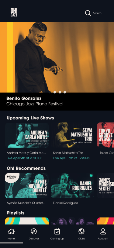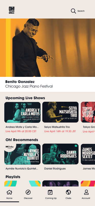
An Oh! Jazz platform redesign for the aging population
The goal: mitigate & accommodate.
Oh! Jazz’s primary customers and OTT users are 50+ years old, yet the website and OTT platform did not keep their needs in mind.
The navigation was not intuitive and lacked information. The contrast between the background and CTAs was poor across all devices.
Wide Angle
There is a need to design for the aging population, but also to design for trust
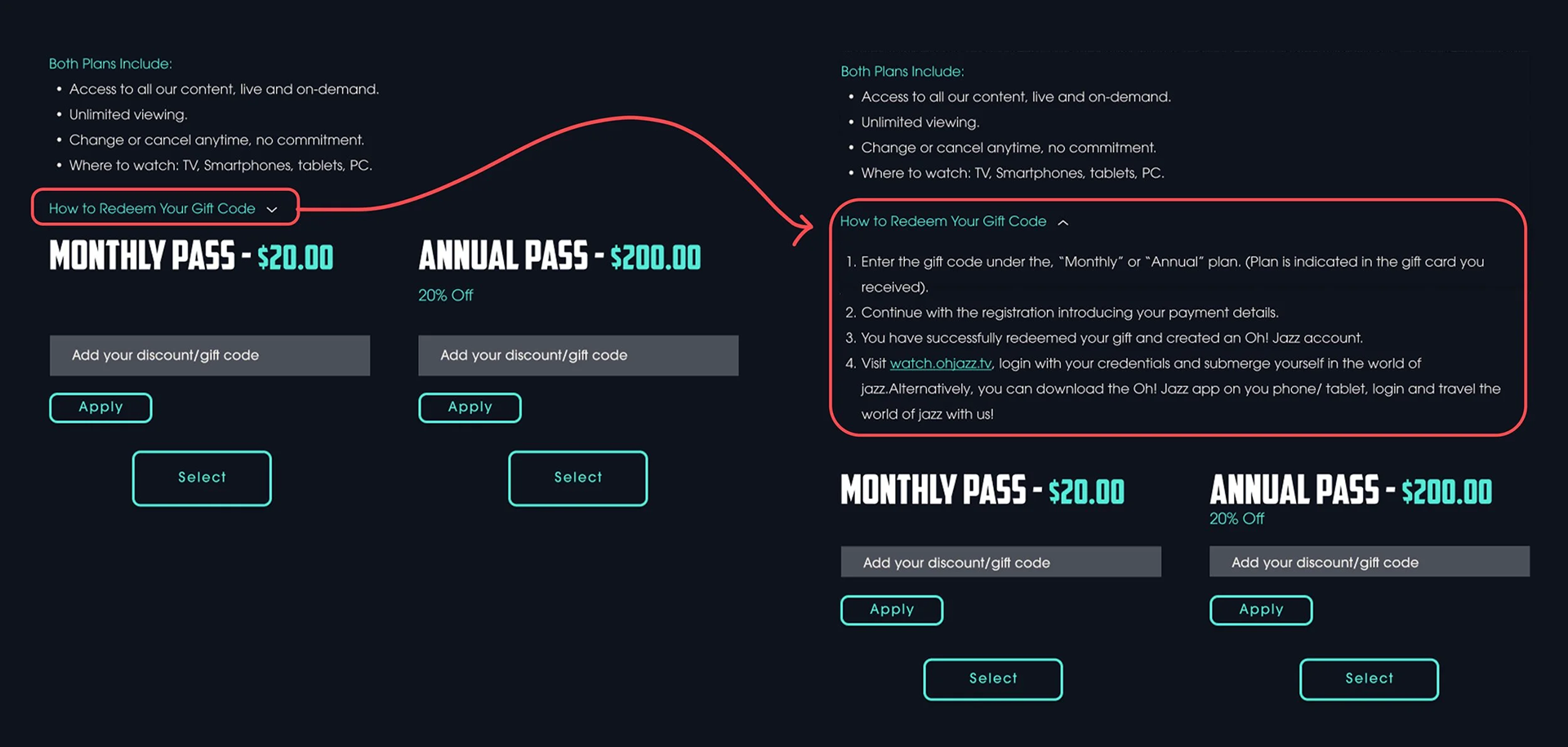
Our older customer base, specifically our Japanese customers, provided feedback requesting more guidance and reassurance during the registration process. Specifically, on how to redeem gift codes. Our solution: provide a step-by-step guide.
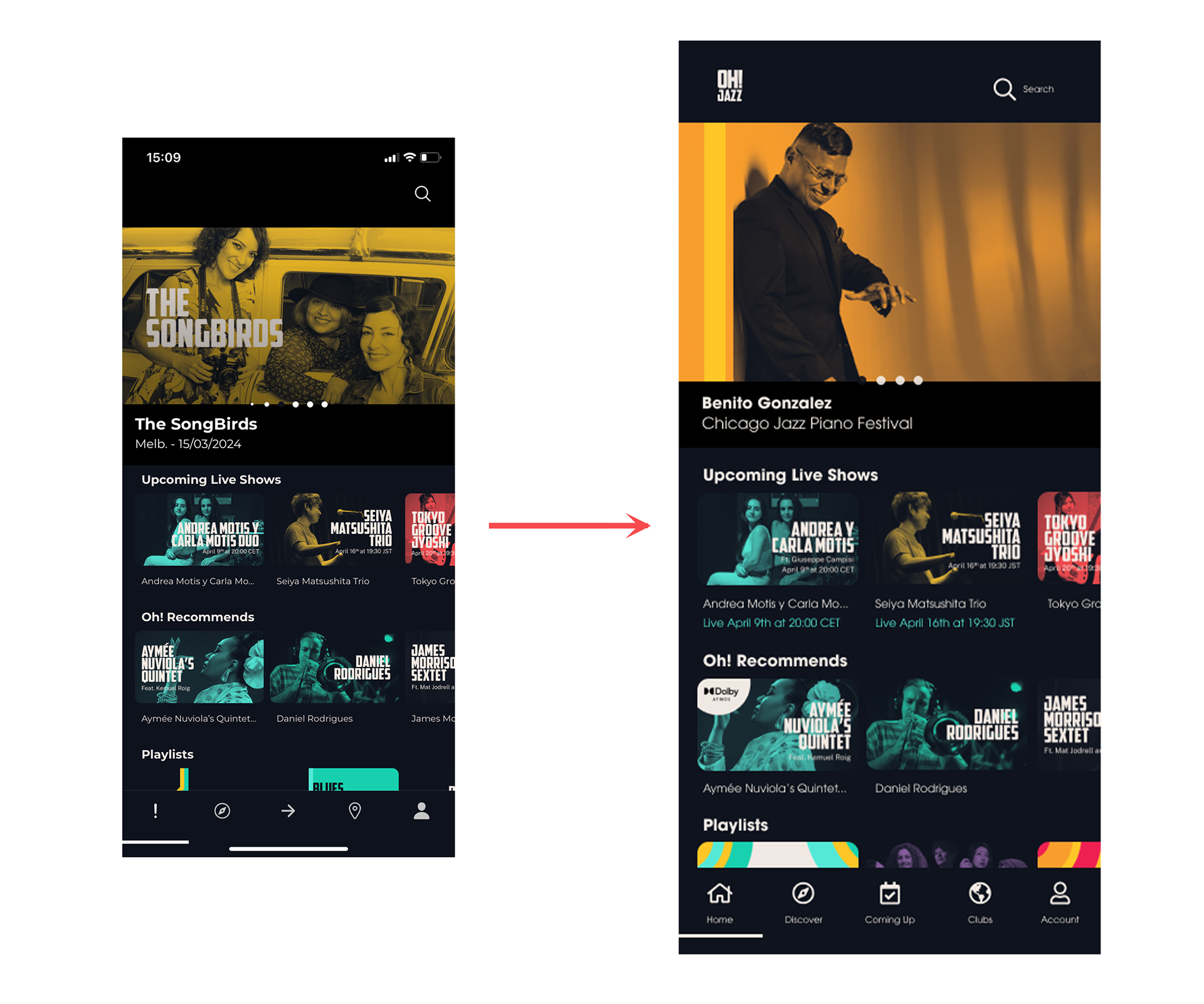
Recognition vs Recall
As a young graphic designer who taught herself some UX/UI basics out of interest and then began designing a jazz platform, the intention behind my design choices was to be abstract and play with the meaning behind the icons, given that Oh! Jazz is a groundbreaking and new idea.
We wanted the icons to be ambiguous and minimalistic, which worked against us. By doing so, we created a conflict between novelty, crafting a unique image/UI, and the needs of our customers.
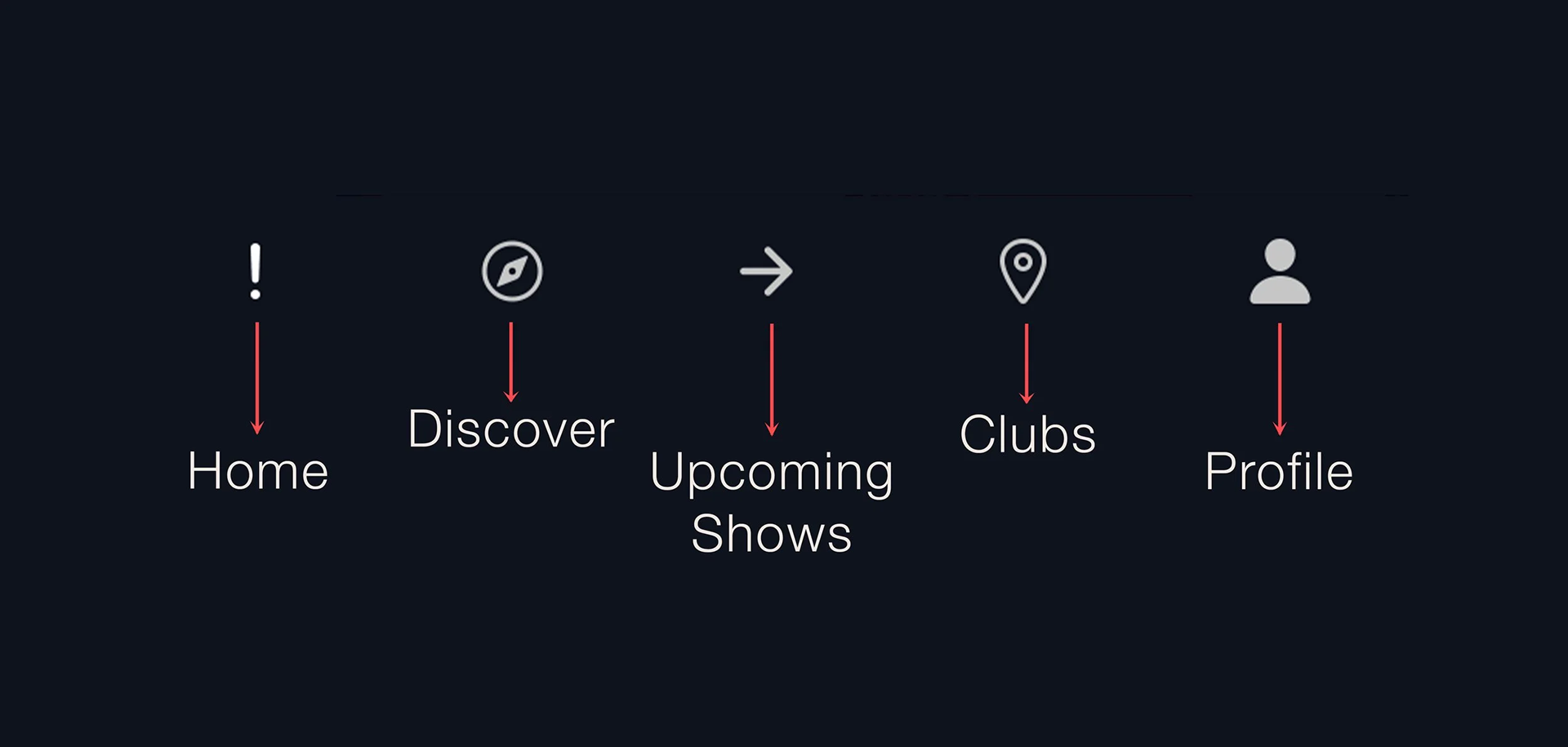
The main takeaway – Don’t rely on icons alone; add descriptive labels.
Solution
1. Moved away from abstract ideas. Updated icons to be more intuitive.
2. Added a label below each icon for quicker recognition.
Contrast & Legibility
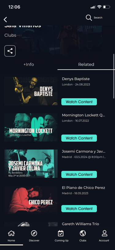
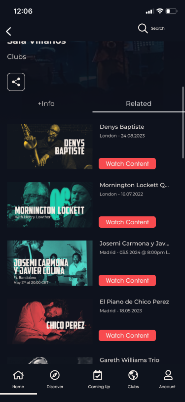
In the original design, there was no button for the CTAs. We added a button and tested the color contrast ratio.
Blue – 12:39:1
Red – 5:4:1
We moved forward with blue.
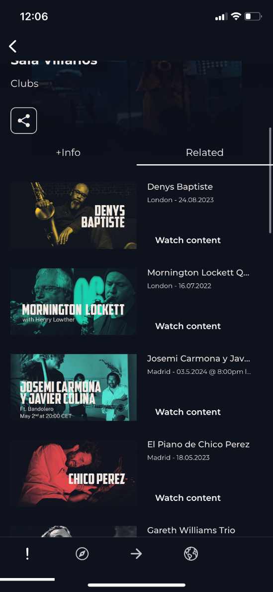
Original
Dark vs Light Mode